脈動
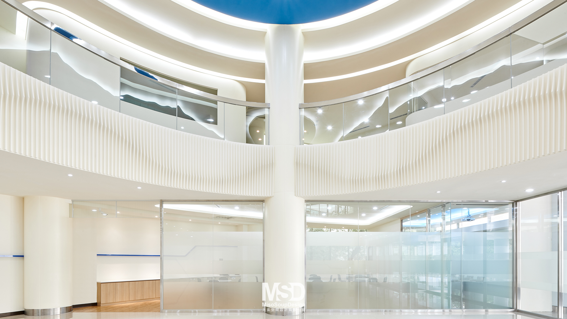
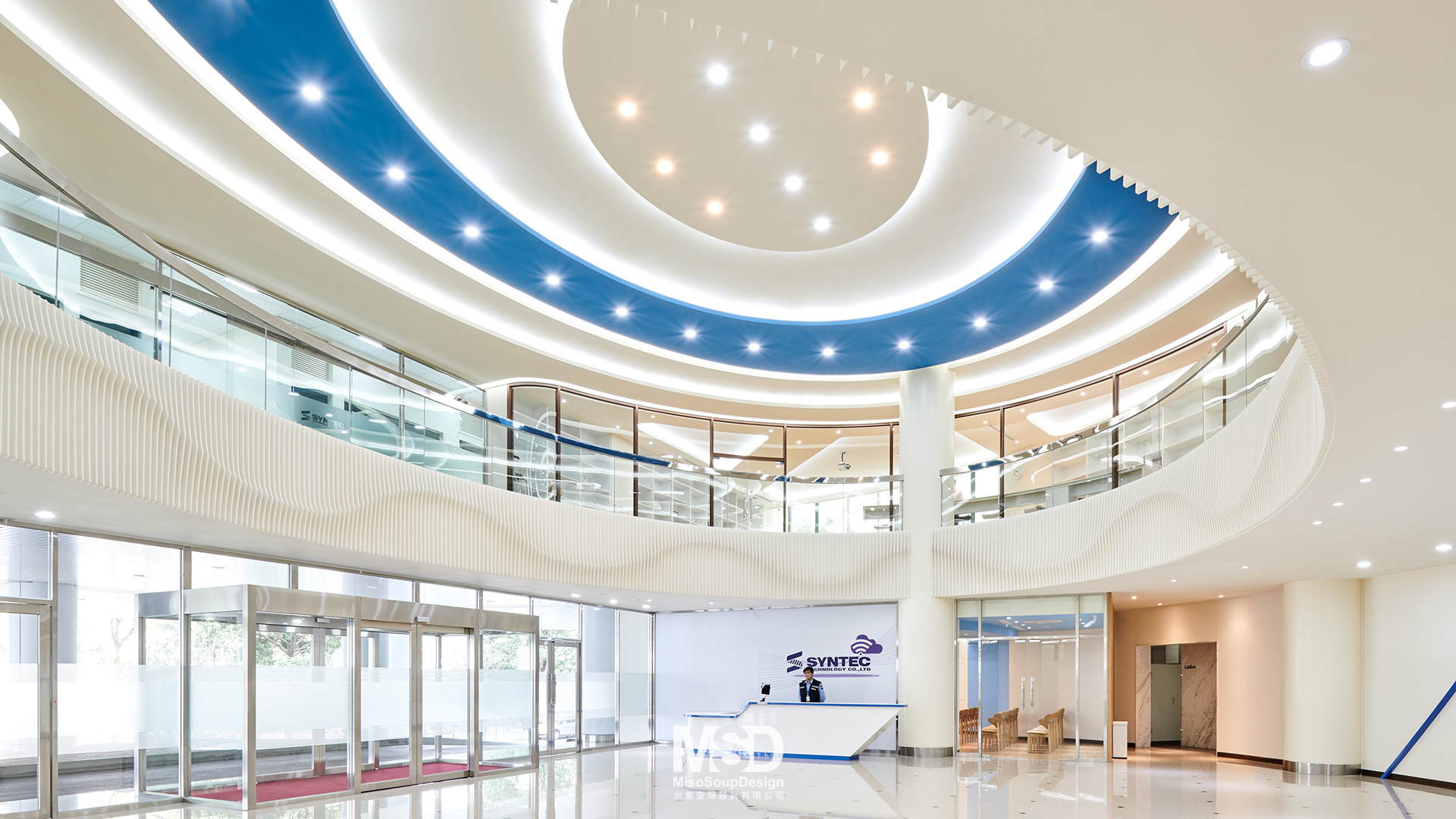
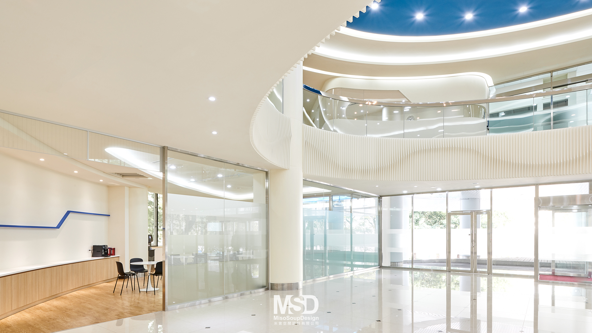
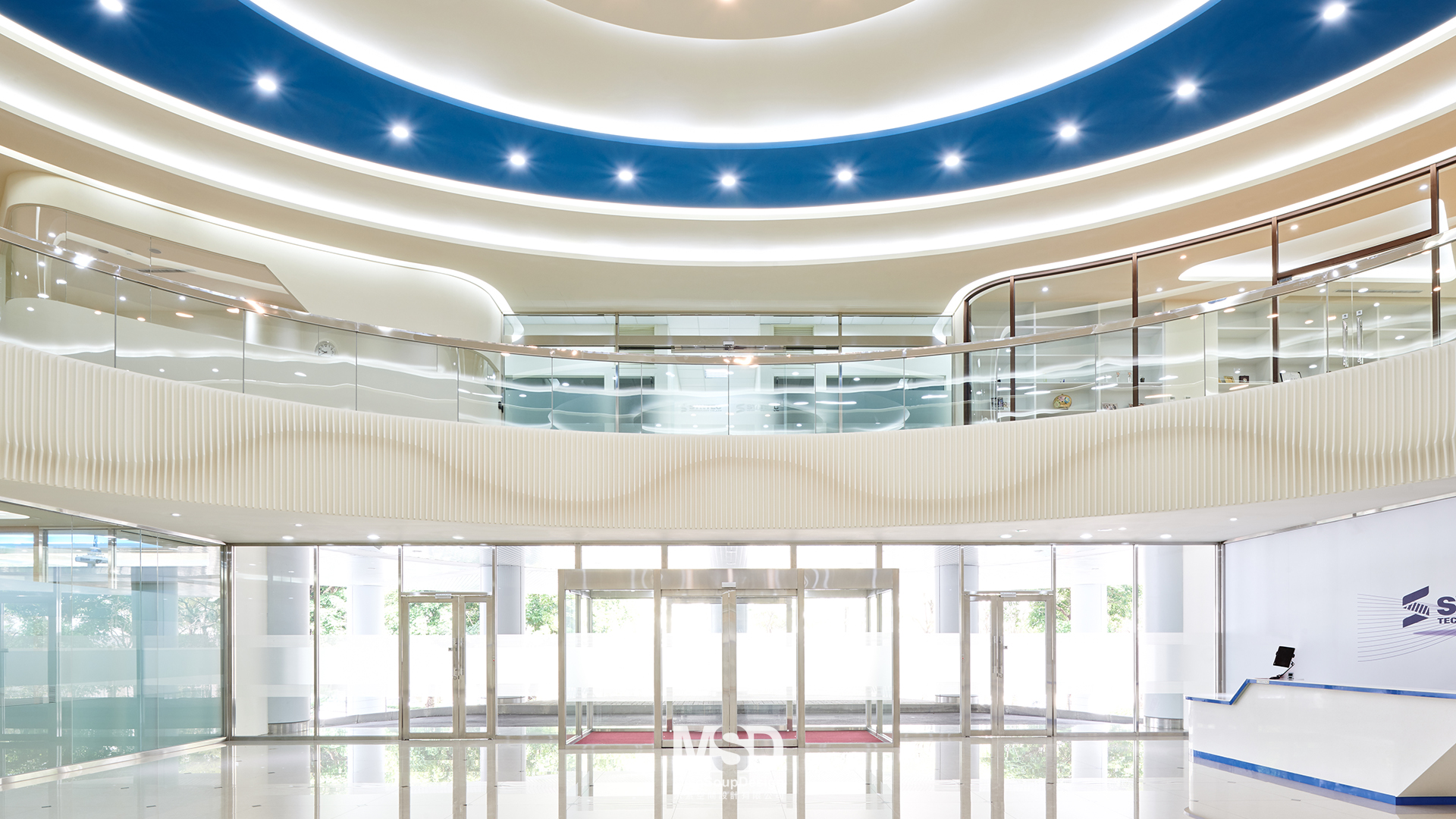
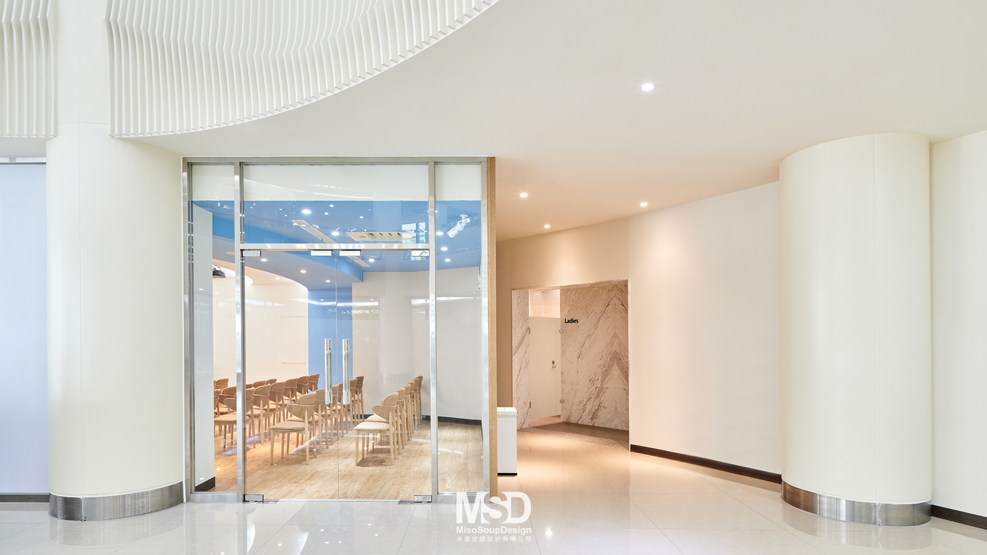
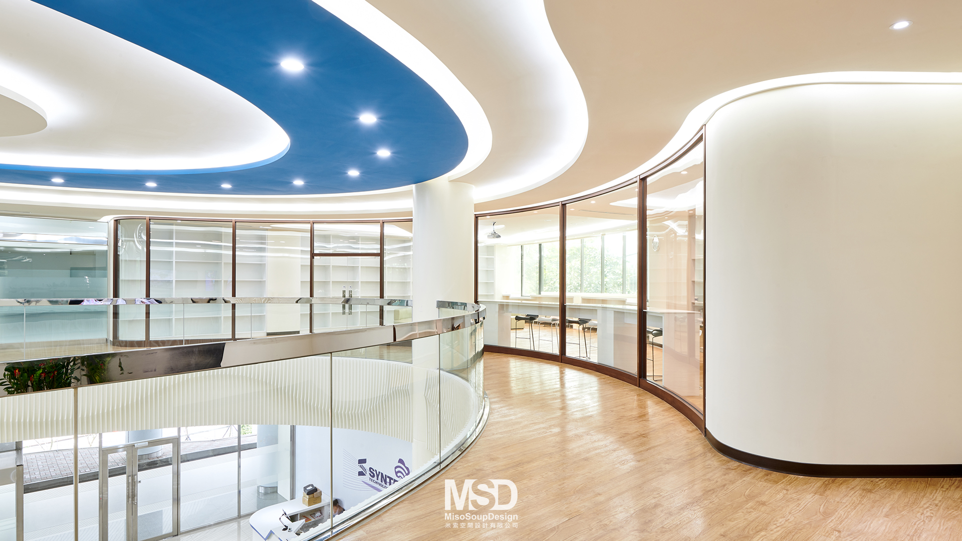
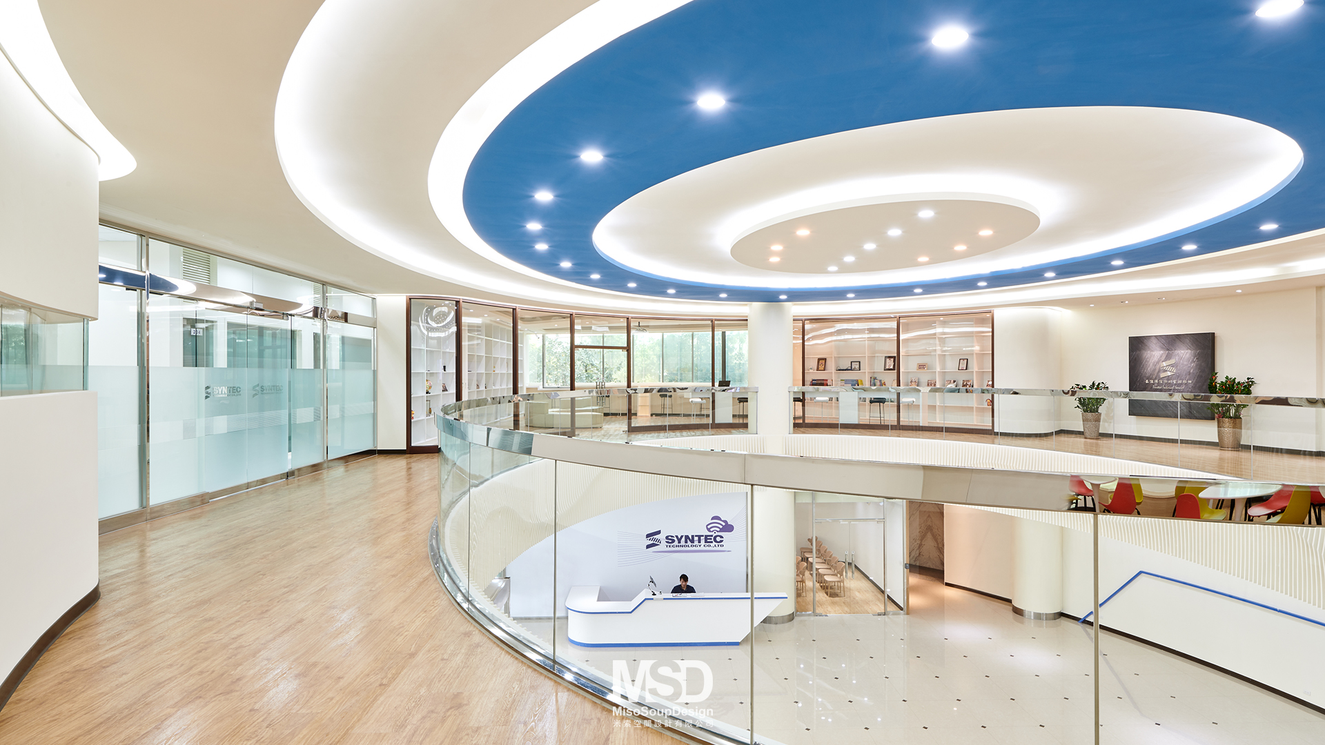
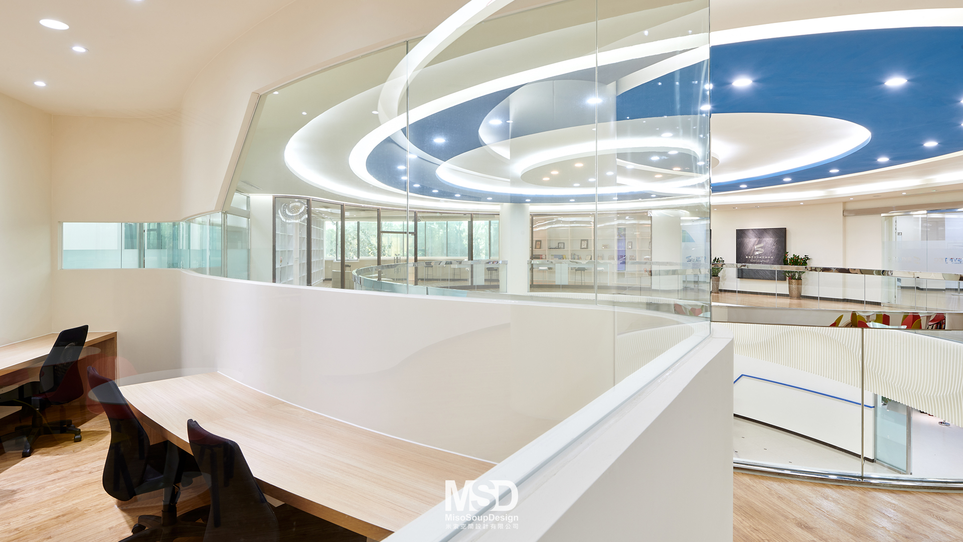
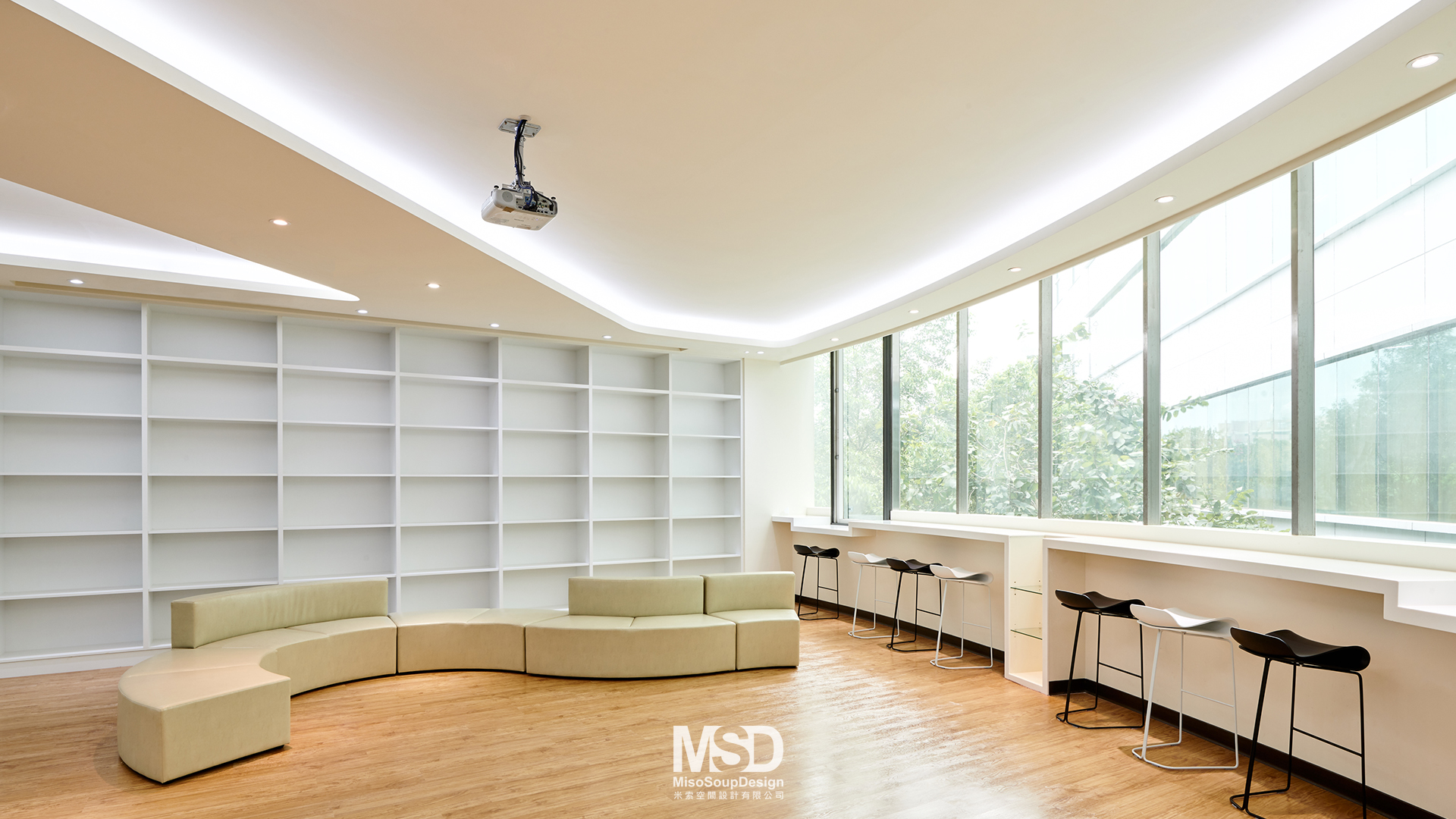
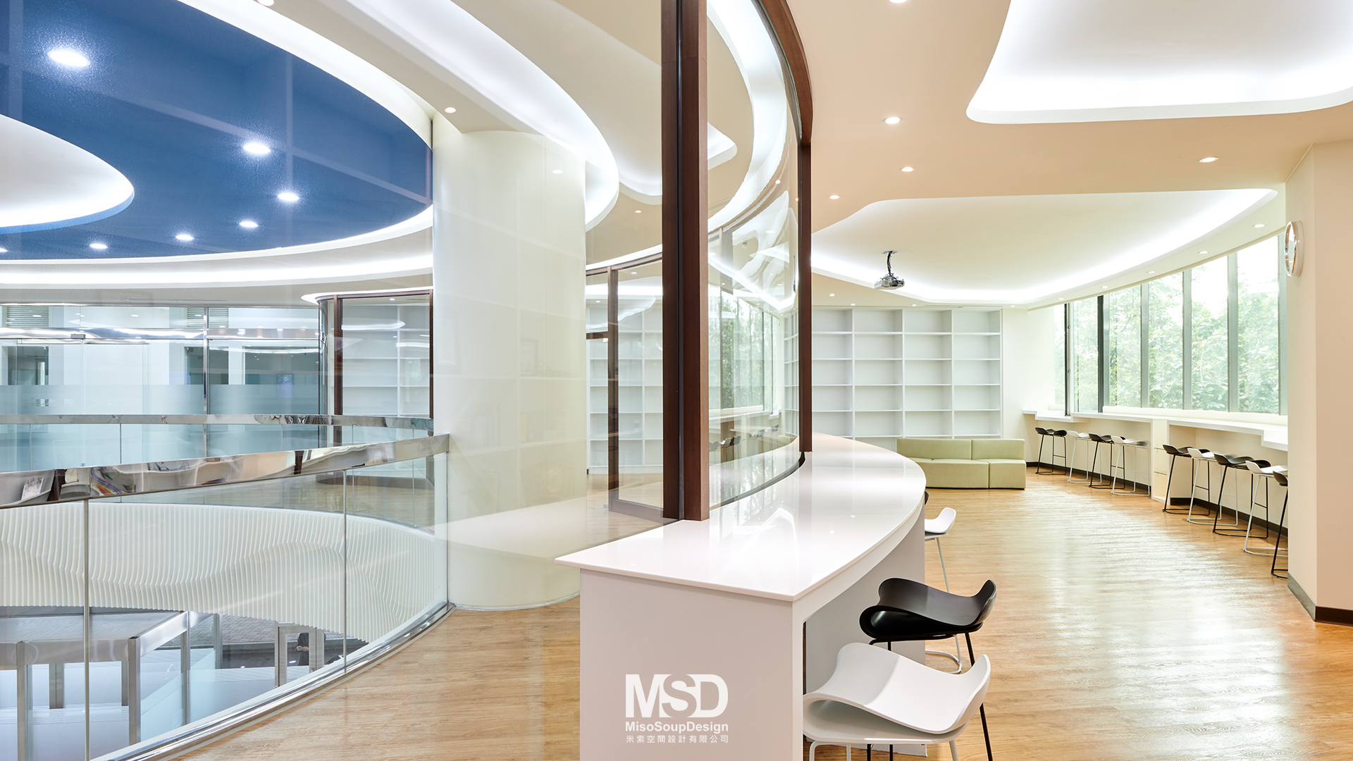
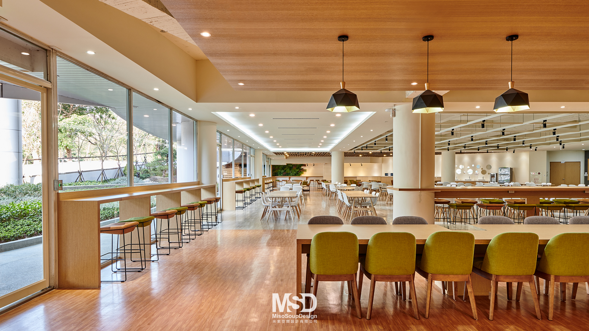
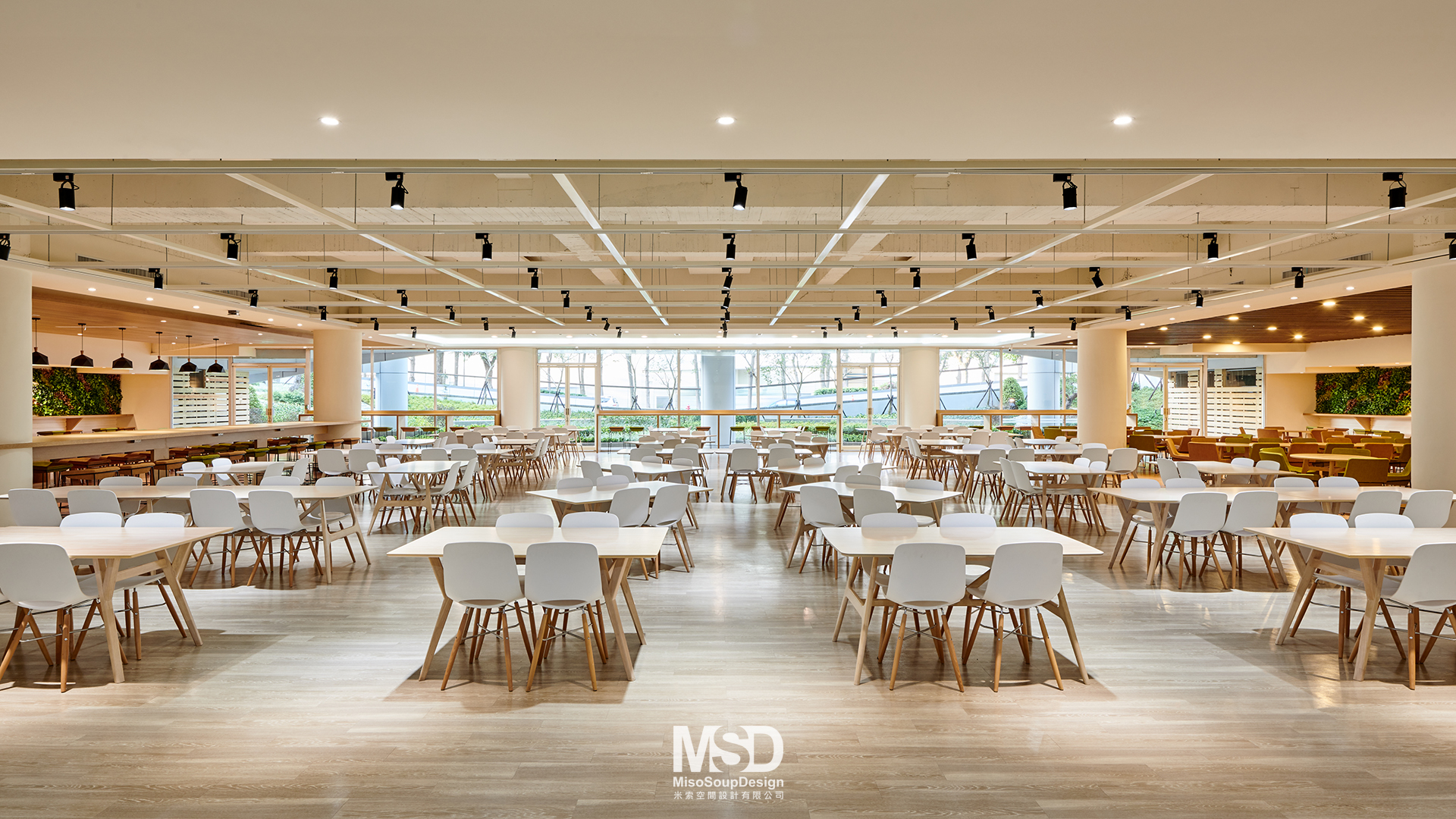
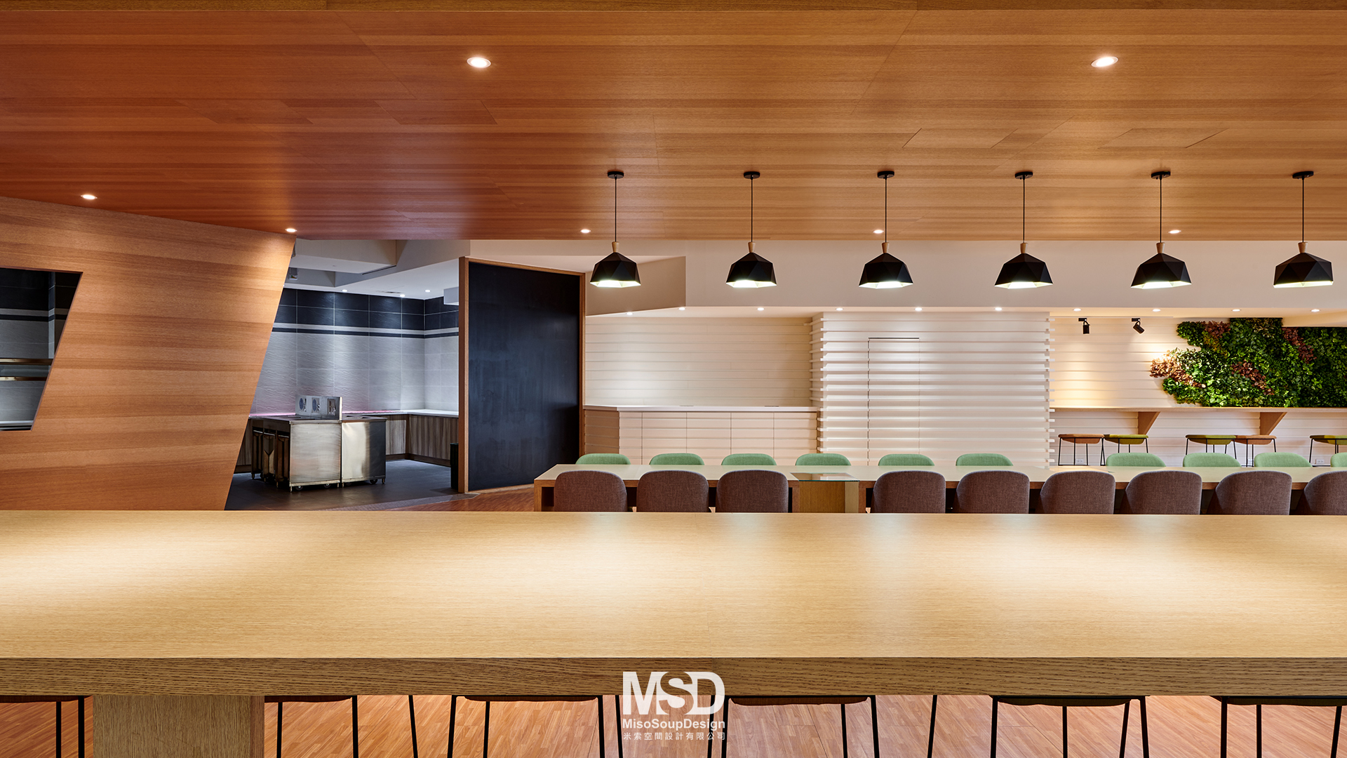
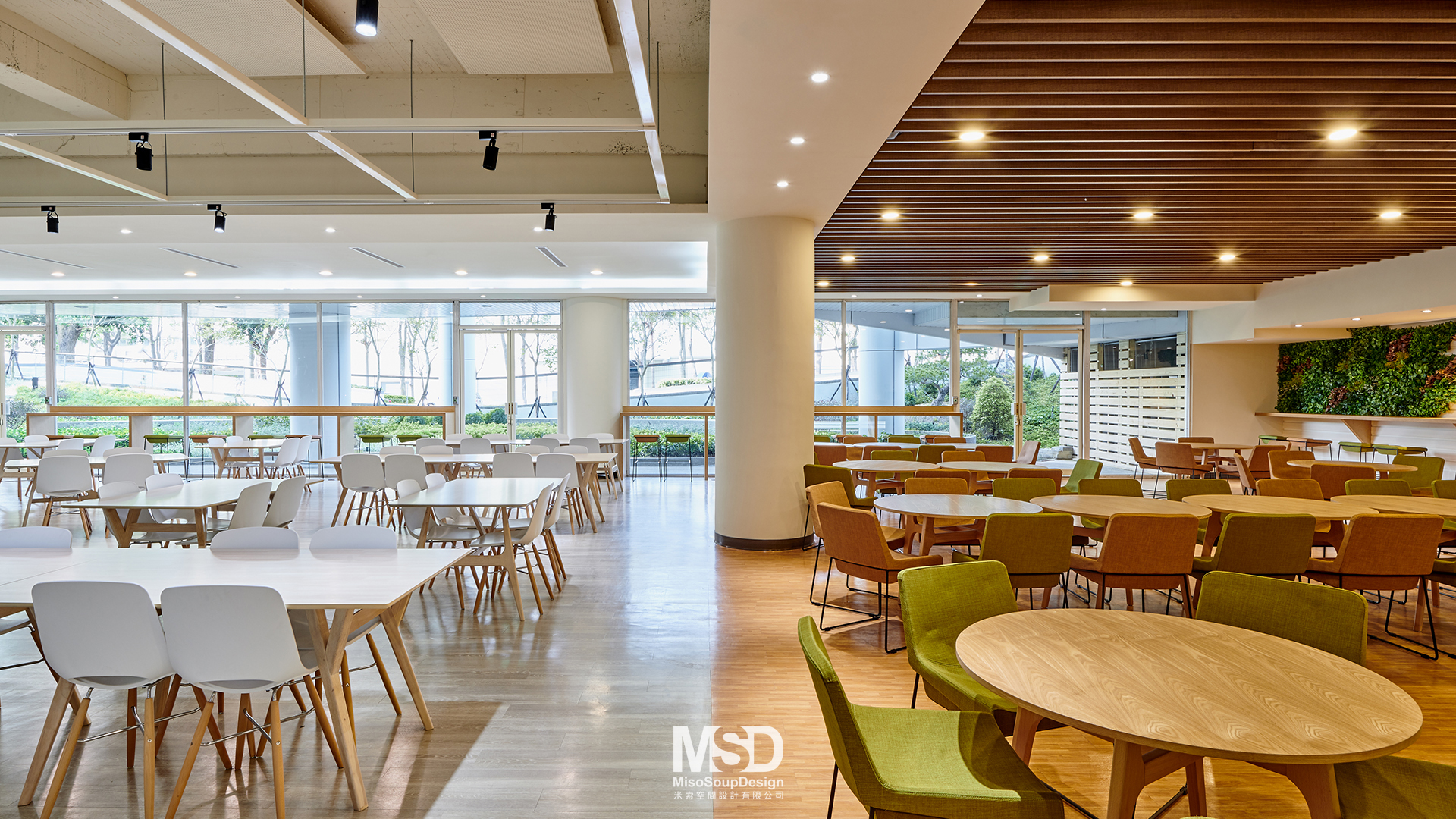
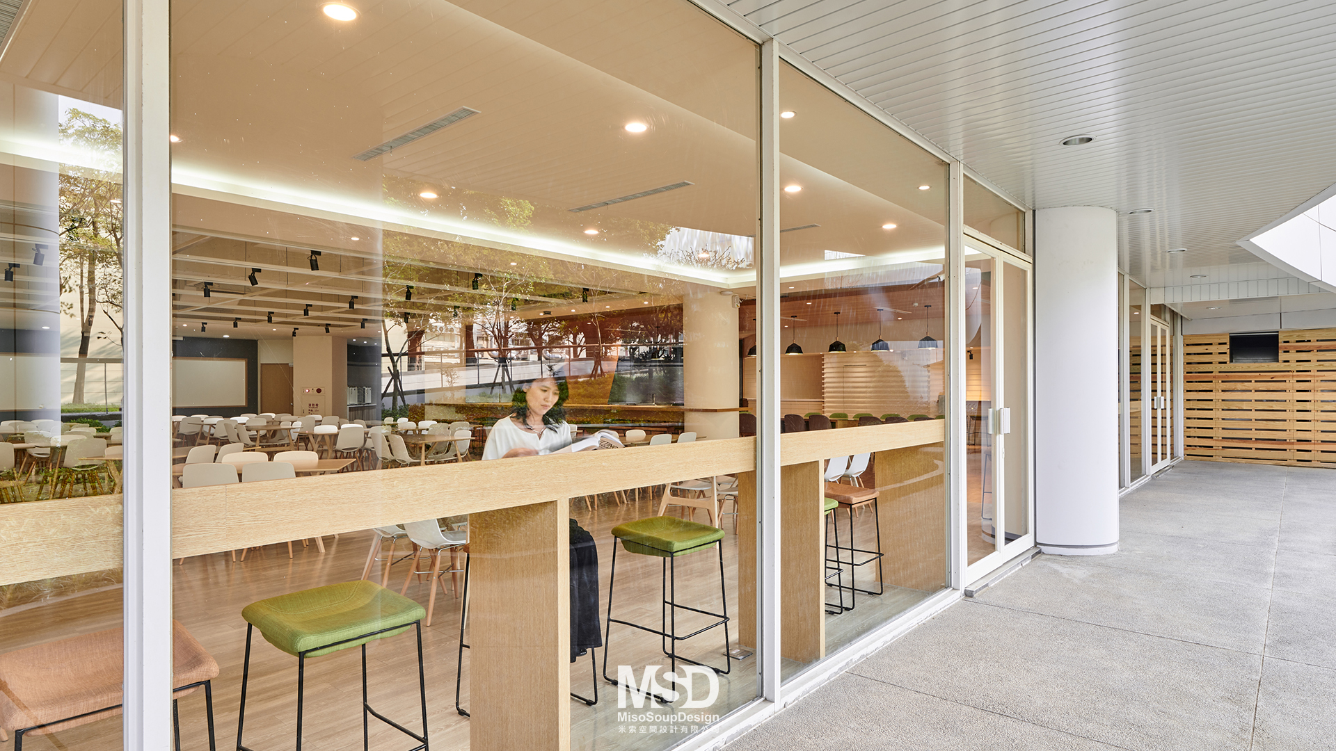
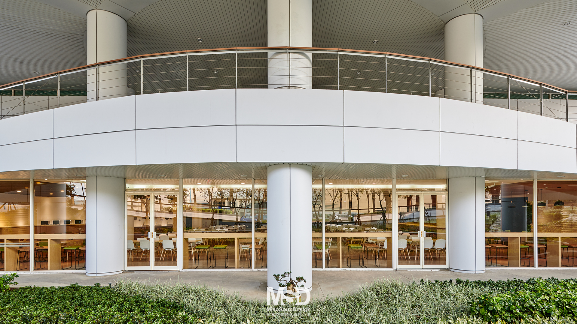
Office Interior20年的老舊廠辦, 進駐了以機械製造起家的新代科技公司. 為了有別於其他公司, 我們重新審視品牌和公司形象的意義, 希望在打造全新辦公空間的同時, 跳脫傳統科技業的厚重感, 此設計希望將公司識別色 「新代藍」做為重點色, 強調時尚感並活化企業形象。流動型的格柵成為入口的主視覺, 輕盈猶如緞帶環繞在2樓邊緣, 注入新的脈動。保留了原本建築物既有弧型挑高, 大廳設計了相呼應的橢圓天花, 並用條狀的間接照明強化流動感。 設計的概念源於科技公司所著重的機器手臂和雲端管理, 以俐落的流線型取代原本四方的幾何地磚和天花板燈具。改造原本陰暗的大廳, 採用無隔間設計, 大量的將自然光引進, 創造明亮的公共空間. 二樓的多功能室延續了大廳的線型設計, 讓原本單調的空間更多變化。B1員工餐廳則採用較細緻的木紋, 開放式天花板搭配實木家具, 配色較溫暖柔和, 希望用餐時能夠自在放鬆。戶外的植栽前設立吧台桌, 就算單獨用餐也能充分享受綠意。
To differentiate from other technology companies in Hsinchu, we re-evaluate the idea of branding and corporate identity, hoping to get away from heaviness of traditional image of the industry, yet making a brand new impression of how technology would be in the current time. Using the “Syntec Blue” as the accent color, it elevates the sense of fashion and activate corporate image. The louvers are designed with a fluid shape to create a main theme of the lobby, flowing gently on the side of the 2nd floor, leaving the impression of “vibe”. Although the design has kept the original double-height oval cut out, the ceiling echoes the shape with lit by indirect lighting source, enhance the flow through entire space. The design concept originated from the robotic arm and cloud management that the company has developed, therefore we replaced the square shaped tiles and lighting fixture with more modern looks. To change the dark feeling of the lobby, natural light is drawn to the space to make the space brighter and more optimistic. The multi-purpose space on the 2nd floor continued the design concept and creates a fun space to read and host events. At B1, wood grain is introduced to make the cafeteria more relax and comfortable to enjoy their lunch. Even when a person comes to eat alone, one can still enjoy the greenery right in front of the bar counter.
- Client Syntec
- Year 2018
- Services Interior design
- Photographer studio millspace 揅空間工作室

