New Taipei City Gender Neutral Public Toilet
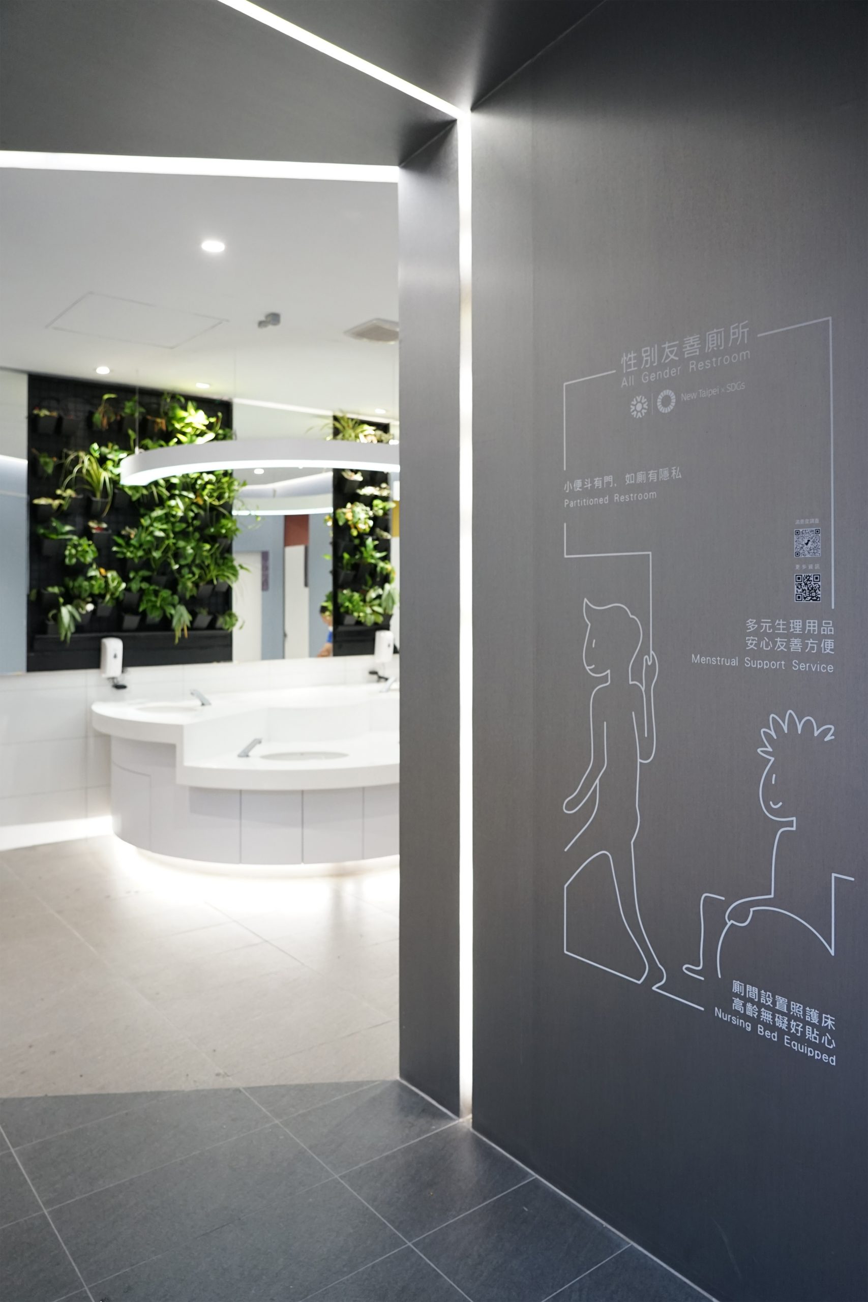
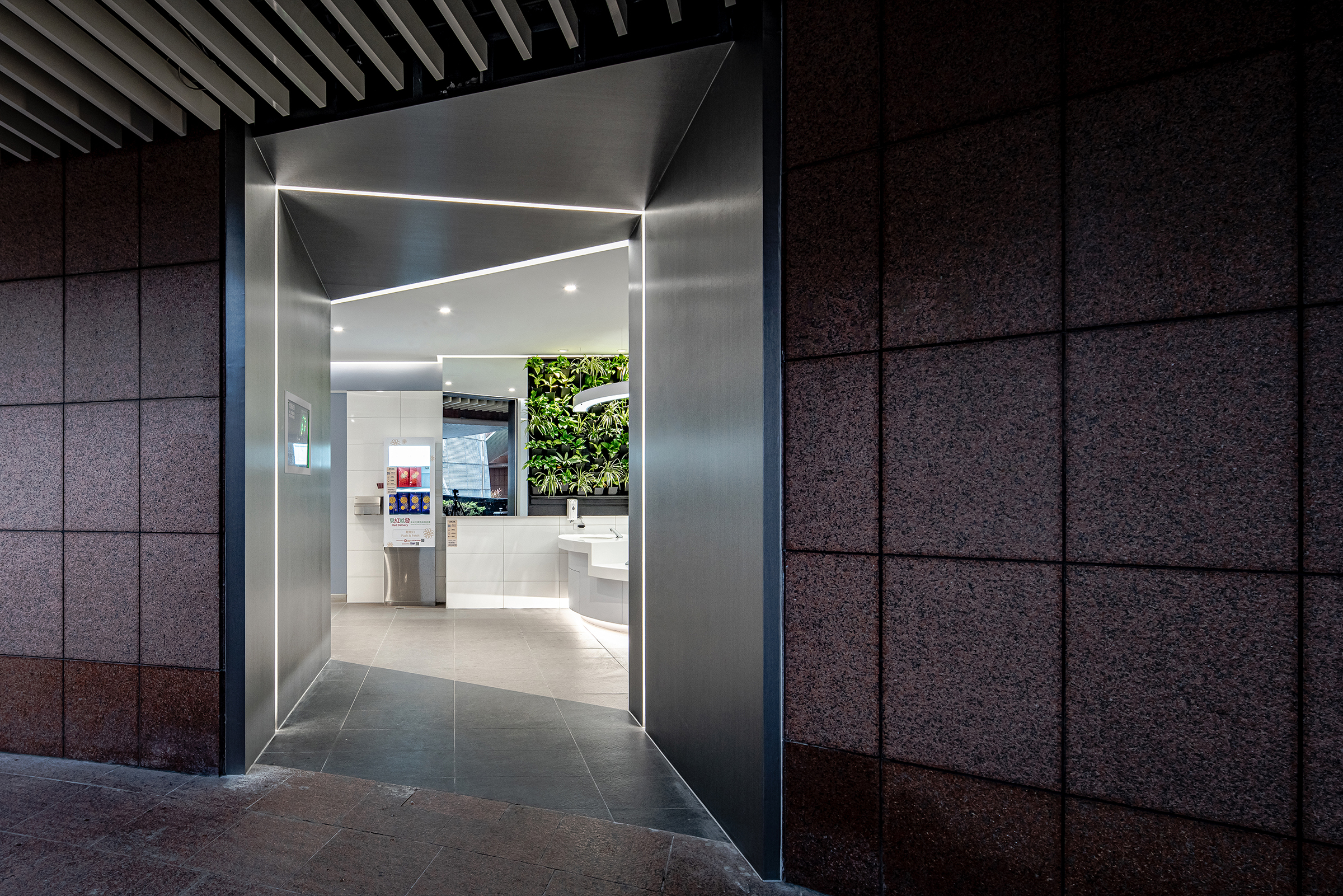
The initiative of the all gender restroom is to “achieve gender equality and empower all women and girls” (SDG5), the design needs to consider users of all genders, the elderly, the disabled, and parent-child groups. It is hoped that the completion of the improvement of this case can become an example of new public facility of New Taipei City, and carry on the Sustainable Development Goals. The public toilet project is located on the east and west wings of the ground floor of the New Taipei City Government Civic Plaza. We believe that public toilets are important and it must be suitable for everyone, not a few individuals. Therefore, the design of public toilets requires good planning and careful thinking to transform the original module into an innovative one.
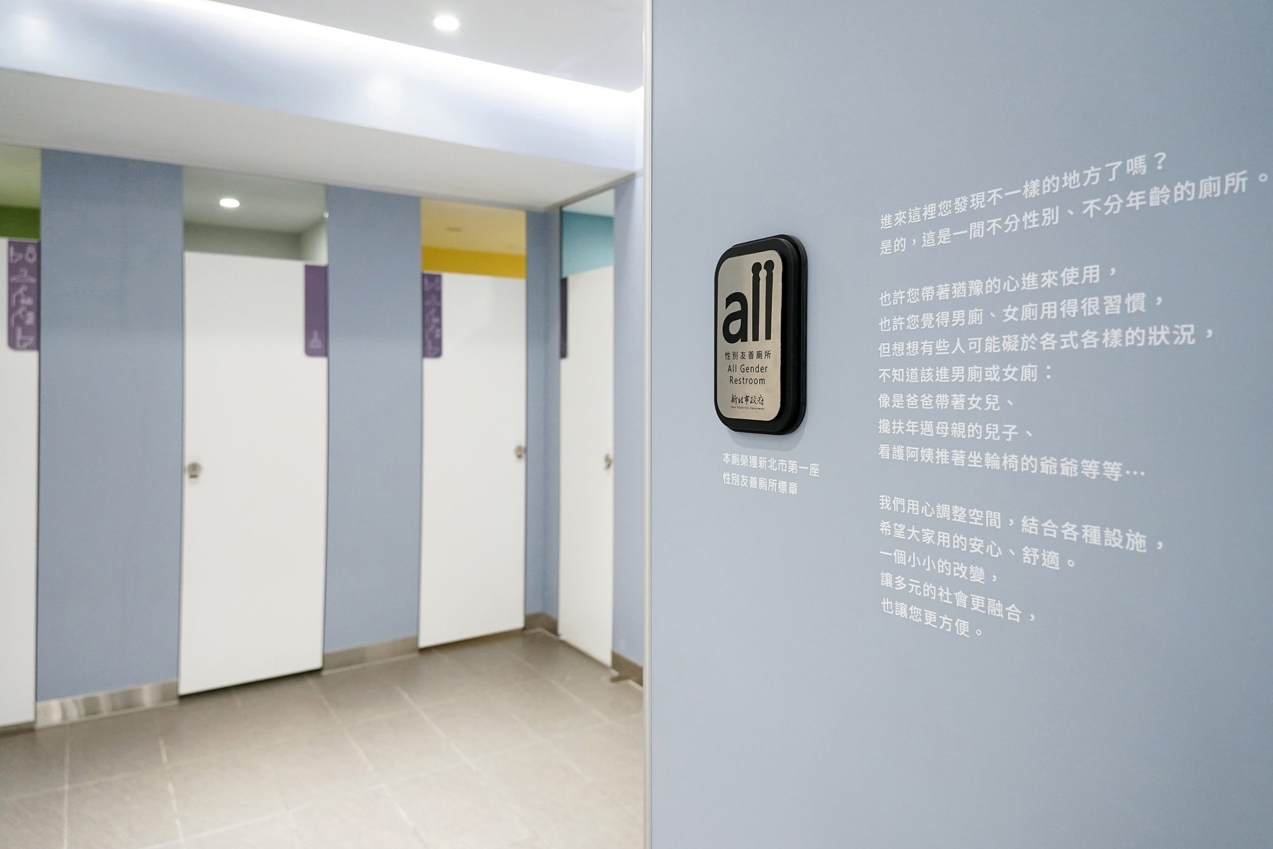
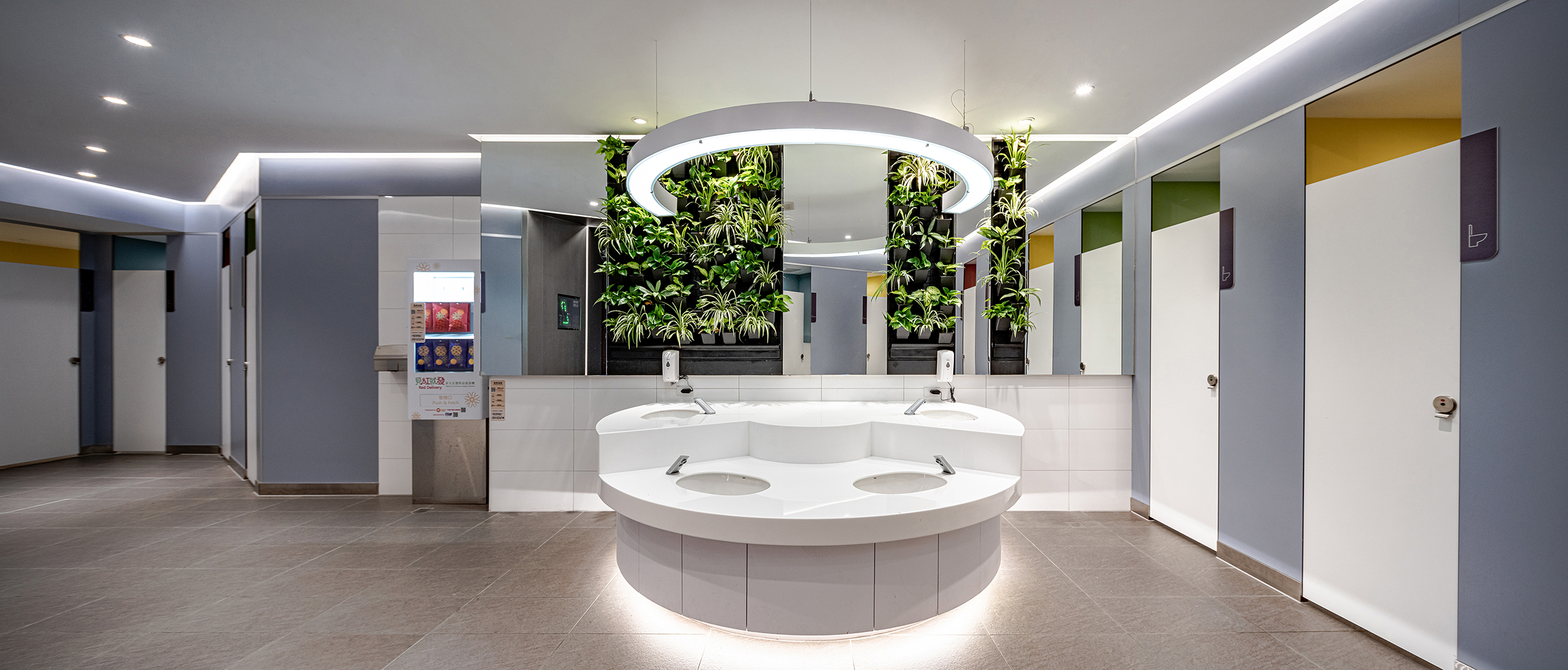
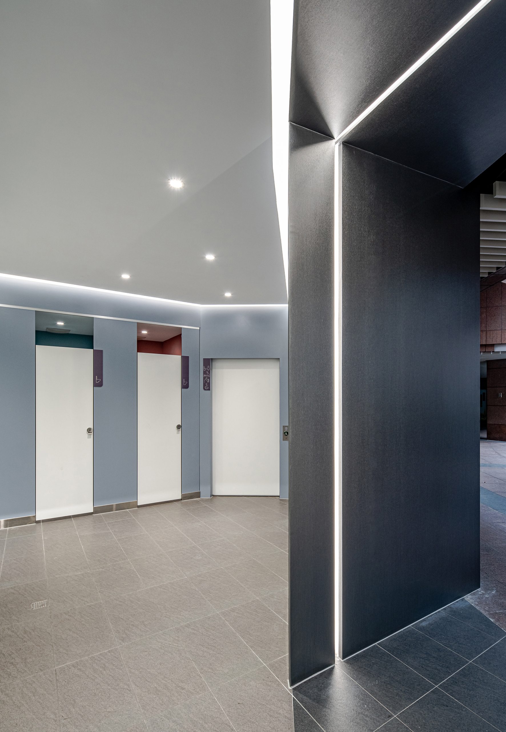
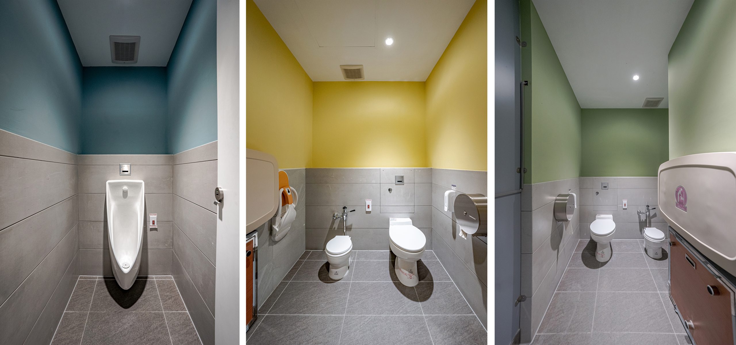
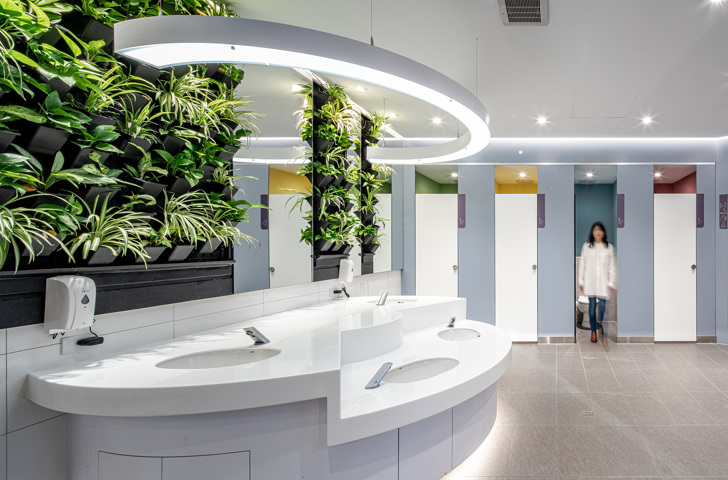
In terms of visual design and color selection, in order to break the stereotypical color choices, such as baby blue and pink to separate men and women, a neutral gray is chosen for the partitions, and four colors are used in the toilet to enhance the recognition. Large areas of white ceilings and floors, combined with indirect and direct lighting, make the public toilets bright and safe. The curved washbasin in front of the green wall not only represents centripetal force, but also sets up children’s washbasins for families to use together. We look forward to a better and simpler toilet design can solve public safety and public health problems, and also provide needs for people with special needs, avoiding the embarrassment of gender divisions when parents bring their children to use public toilets. This is not only a Gender-Neutral Design, but also an Inclusive Design (a design for all ages) that is suitable for the elderly to infants, providing a better and more secure public toilet.
新北市政府市民廣場地下一樓東西側廁所, 是貫連新北市政府園區與台鐵、高鐵及捷運三鐵共構的板橋車站地下通廊, 自建置開放使用至今已逾18年, 設備老舊已不敷使用. 公共廁所之重要在於必須適用於所有人, 因此更需要良好的規畫和細膩的思考, 將原本的模組轉變更為創新。 公廁原本男女分開, 平面為弧邊的長條型, 排列不易之外還有許多不好使用的死角。在重新配置的同時, 同時也將身障者需求納入規劃,整合SDG5(永續發展目標5) 實現性別平等、多元尊重的核心理念,提供市民廣場使用者不分性別、不分年齡皆可安心使用之如廁環境。
在識別設計和色彩選擇上, 為打破傳統公廁用粉藍色和粉紅色區隔男女的刻板印象, 選用了較中性的灰藍色, 廁間內則使用了四種顏色來加強辨識度. 大面積的白色天花和地板, 讓公廁的氛圍明亮安全. 綠牆前方的弧型洗手台, 除了代表向心力之外, 也設立兒童洗面盆方便親子一同使用. 我們期待這樣更好更簡單的廁所設計, 能解決公共安全和公共衛生問題, 另外為有特殊需要的人提供所需, 避免父母帶著孩童使用公共廁所時, 因為性別的劃分而產生尷尬。
- Client New Taipei City
- Year 2021
- Services Interior renovation

